Sage Advice, LLC

Paul Sage's Marketing Work and Observations

Two days ago, I posted a photo and question on my LinkedIn page. I have already achieved a personal record for impressions and engagement. Everyone has an opinion.

Here is the link to my LinkedIn post.

What do you think? The older packaging on the left, or the newer one on the right? Which one will fly faster off a shelf at Walmart or Target?
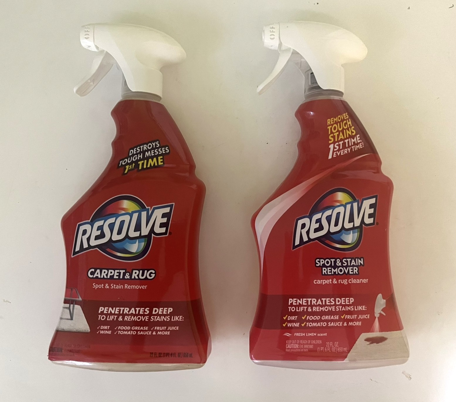
Posted in

One response to “Tackling a Question with Perplexing Resolve”

  1. detectiveimpossiblec127d57bdf Avatar
    detectiveimpossiblec127d57bdf

    I agree with the art director change on your linkedin.
    Two things for me keep carpet & rug. I was in Walmart yesterday looking for a rug cleaner – really, true story..
    I passed on Resolve, because I wanted a carpet & Rug cleaner specifically. I didn’t want a “general” stain and spot remover. Bought Hot Shot Instant Carpet Stain Remover.
    Also I think they are setting themselves up for failure with “Removes Tough Stains 1st Time Every Time”. The time you need to try to remove a spot second time eliminates the product because it doesn’t do what it says.
    Finally, the new warnings and graphic showing how the product are used are distracting.

    Before I retired from J&J, the company changed its logo J&J (J&J in script) to a more softer, gentler curved J&J. Two reasons more welcoming because of the softer, gentler J&J and the new generation cannot read script. $25+ million later and hasn’t done anything for the company except make some consultant rich.

    Old
    [cid:84c8f883-0bb4-4fb3-8056-d414fe4238e9][cid:024d40dd-67a7-4097-94ed-a0c32307a862]

    New

    [cid:361b779d-4245-4570-ae53-9fa80903d30c][cid:95cc3fd2-bbad-4323-bb72-e297be0f2db7]

    The old logo was used since 1887, originally based off of the handwriting of founder James Wood Johnson.

    Google summary:

    Johnson & Johnson changed its logo
    to modernize its corporate identity
    following the spinoff of its consumer health business, Kenvue. The new logo reflects a sharpened focus strictly on pharmaceuticals and medical technology. Johnson & Johnson +3
    The primary reasons for the rebrand include:

    Strategic Realignment: The company is now a “pure-play” healthcare company focused on advanced therapeutics and medical devices. The new brand unites its Innovative Medicine and MedTech segments under one unified vision. Pharma Voice +3

    Digital Optimization: The iconic cursive script—based on co-founder James Wood Johnson’s signature and used since 1887—was elegant but difficult to render clearly in small digital formats. The new, clean font uses single pen strokes for better accessibility on screens and in motion. Johnson & Johnson +2

    Modern Humanity: The new script and refreshed, brighter shade of red aim to convey a forward-looking, agile, and human-centric approach to healthcare. Johnson & Johnson +1

    Another side note – when J&J spun off its consumer business in 2023 they sold off Band-Aid – the product they were founded on.

    Bad karma. 🙁

    Like

Leave a comment